
A symbol for the fediverse ⁂
symbol.fediverse.infoWe propose the symbol ⁂ to represent the fediverse.
We propose the symbol ⁂ to represent the fediverse.
You must log in or register to comment.

A community dedicated to fediverse news and discussion.
Fediverse is a portmanteau of “federation” and “universe”.
Getting started on Fediverse;
- What is the fediverse?
- Fediverse Platforms
- How to run your own community
- 0 users online
- 92 users / day
- 135 users / week
- 187 users / month
- 420 users / 6 months
- 1 subscriber
- 1.06K Posts
- 13.9K Comments
- Modlog
- mods:


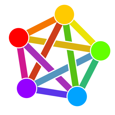
There already is a symbol for the fediverse:
This has existed for years already, is used widely, and IMHO looks way better than this dull attempt. I see no good argument in the campaign website for using this new one instead.
The weak argument they make is this doesn’t look good at small sizes. Personally I don’t think that constitutes a good enough reason to rebrand the fediverse
I commented on the last post about this, the three stars are difficult to make out on a small screen, they look like a blurry capital A. On top of that, it’s apparently used in astronomy to represent clusters of stars, like a constellation.
The whole point of this campaign appears to be to replace a unique symbol with one that’s already in use and is hard to read at small sizes 🤷🏻♂️
Exactly. A logo isn’t meant to work at 11 point size in the middle of inline text. The typographical argument is nonsense, and I think this proposal is really a reaction to the idiotic “Satanic panic” over the rainbow pentacle.
Gimme an ASCII character for it. We can replace the bitcoin character with it
This logo is really unpopular hence why there is always so much talk of making something cleaner and more professional.
…and this latest proposal certainly isn’t either of those things.
Source? I’ve only ever seen a handful of strawman arguments that “I’m not offended by the vague resemblance to a pentagram/use of rainbow colours implying LGBTQ+ support, but somebody might be”, but its fairly wide adoption suggests that most people — myself included — actually like it.
As several people have already pointed out on the other thread, we already have a well-established fediverse logo:
About the current “pentagram” symbol:
We’ve used it as a tiny icon below posts from other instances and I’ve never found it problematic. I think it’s already too well established to replace just because we can’t type it. Besides, the three stars feel to me not distinct enough. Pushing Unicode Consortium to add it to the standard when the time comes is a batter way.
I do think however that it would be worth coming up with a proper name for the current symbol.
The Fedigram maybe?
What else!? 🏅
Instead of changing the symbol, we can ask the unicode committee to put the current fediverse symbol in the unicode.
That’s what I said
I shouldn’t comment just after waking up.
3 cat buttholes. I love it.
There is a hidden 4th.
Looks like 5 to me
You had to say it.
It’s buttholes all the way down
Note that if supported by the font you use, the three symbols will usually be drawn the same way as an asterisk (*) in that font. This means a lot of variation.
Your browser’s rendering: */⁂
Several typefaces’ rendering of Unicode

U+2042 ASTERISM:I think the diversity is alright! It’s like the Fediverse: instances follow a standard to work with each other but can be heavily customized without breaking integration.
One of them is not like the others.
What the fuck is Lust Text?
A surprisingly serious typeface from Adobe Fonts.
IMO, the most egregious one is Essay Text.
Send nudes
Dude, it’s less clear than the existing symbol. Stop trying to push this.
Is it like that because we’re a bunch of snowflakes?
My first thought.
I appreciate the argument, but I feel like there’s too much of a chance that we can do better with something in unicode. Or, that this isn’t really good enough. Three asterisks is just too meh, IMO, to catch on.
⁂ … to me right now just looks like a splodge on the screen.
Somewhat unfortunately, the pentagram in the older icon probably can’t really be used without some cartoon-ification, because reasons.
Uh… It is Unicode.
U+2042 ⁂ ASTERISM
I know, but Unicode is big. I’m saying that there may very well be something better.
This is in unicode though? U+2042
I like it! Distinct but still simple enough that it could be easily stylized. The constellation symbolism works for me.
Ideally if it were used as an icon it would be slightly larger than the default text on a given page, though I’m not sure how well it fares on those cheap low-res laptops
*
* *
Hmm
New lems can’t asterim?
Wow. I had forgotten all about that! I wonder if I could still triforce…
Are you trying to do Triforce again?
TIL this is an asterism, but I’m moreso enjoying the word dinkus right now.
So 3 footnotes? A bunch of snowflakes (which we are not)? Just, NO! Find something unique and original, that’s how branding works.
It looks like a bunch of snowflakes or a trip of buttholes.
No thanks.
The icon created by meta gives me shivers…
I know why you did it so fast and why you choose ⁂, it’s already present and works as expected and probably to overcome meta’s implication into the fediverse…
However, every symbol didn’t exist at first and became popular on it’s own because it defended something people found important and fought for (Like the peace symbol)!
Maybe create our own symbol and let it make enough noise so it becomes it’s own symbol?
Sorry if it isn’t clear what I mean by that :/
I think many people share your sentiment and have argued the same point in other threads
Wait…this symbol already existed? What was it used to represent?
It’s in Unicode, duh… Otherwise, you’d need an image to represent it.
See Asterism (Wikipedia)
Behold, the Trihole