cross-posted from: https://lemmy.zip/post/13730919
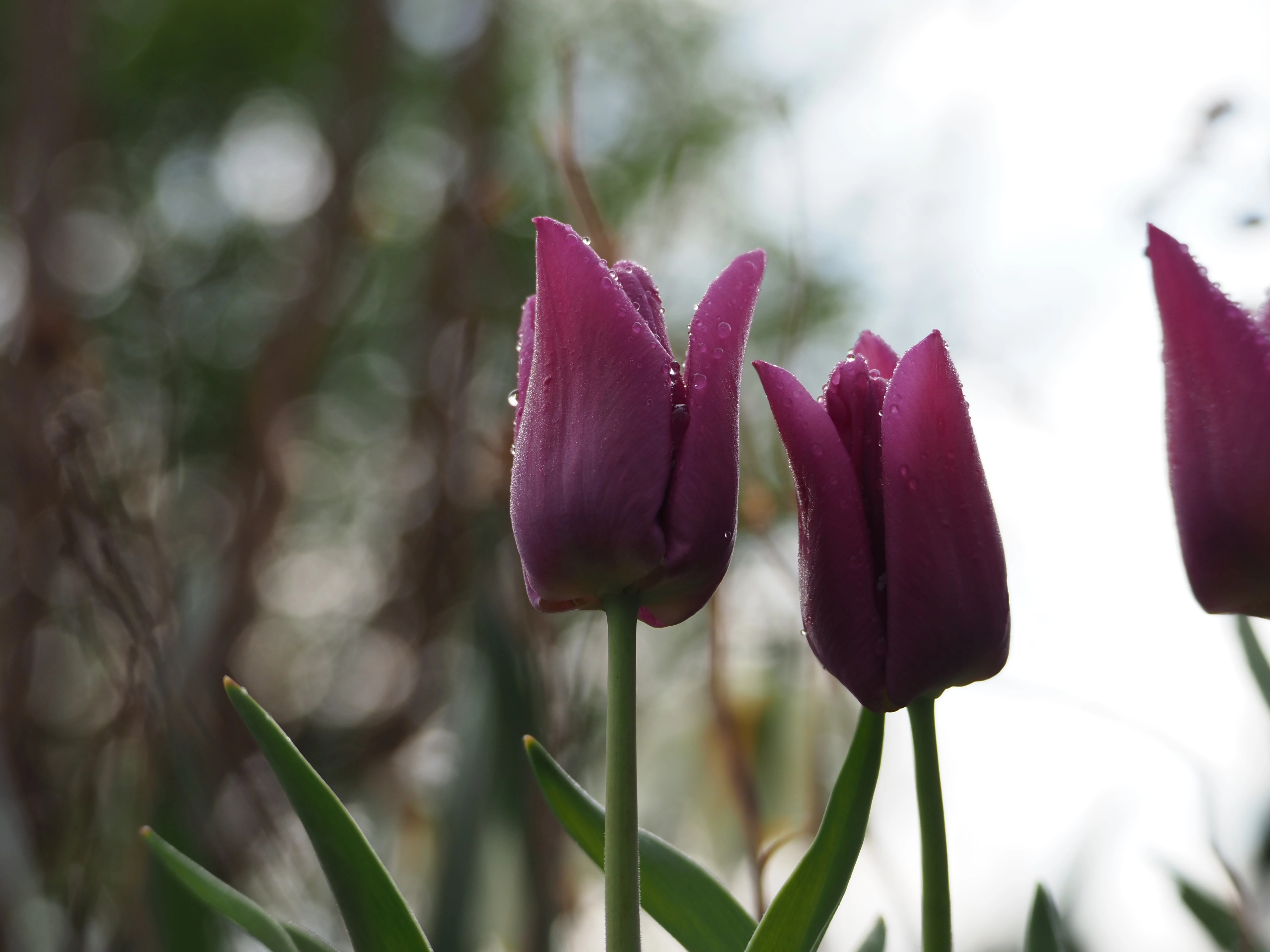
F/5.6 75.0mm 1/320s ISO-200
Here’s a photo I took recently, and I’m just curious if anyone has any feedback on what they like about it or what they think would improve it. No editing other than some compression to lower the file size below my instance limit.
If I were to go back to it again I would probably try to use the stem of the flower to split the background between the bush and sky. Other than that I’m not sure, I’m still trying to learn!
c/photography is a community centered on the practice of amateur and professional photography. You can come here to discuss the gear, the technique and the culture related to the art of photography. You can also share your work, appreciate the others’ and constructively critique each others work.
Please, be sure to read the rules before posting.
THE RULES
- Be nice to each other
This Lemmy Community is open to civil, friendly discussion about our common interest, photography. Excessively rude, mean, unfriendly, or hostile conduct is not permitted.
- Keep content on topic
All discussion threads must be photography related such as latest gear or art news, gear acquisition advices, photography related questions, etc…
- No politics or religion
This Lemmy Community is about photography and discussion around photography, not religion or politics.
- No classified ads or job offers
All is in the title. This is a casual discussion community.
- No spam or self-promotion
One post, one photo in the limit of 3 pictures in a 24 hours timespan. Do not flood the community with your pictures. Be patient, select your best work, and enjoy.
-
If you want contructive critiques, use [Critique Wanted] in your title.
-
Flair NSFW posts (nudity, gore, …)
-
Do not share your portfolio (instagram, flickr, or else…)
The aim of this community is to invite everyone to discuss around your photography. If you drop everything with one link, this become pointless. Portfolio posts will be deleted. You can however share your portfolio link in the comment section if another member wants to see more of your work.
- 0 users online
- 3 users / day
- 3 users / week
- 15 users / month
- 51 users / 6 months
- 1 subscriber
- 530 Posts
- 1.1K Comments
- Modlog
- mods:
- @SyJ@lemmy.ml


There’s more that more experienced photographers can put more eloquently, but as a graphic designer I have two immediate points of feedback:
Thanks for the input! I had crossposted it to the .world instance as well, and someone there had suggested a tight crop like this which I really liked.
I will definitely try what you suggested! Editing is something that I would like to dig into more.
It looks great like this
Since you’re asking for feedback, I would say the background is a little busy for what I would guess your intent is of having a crisp flower shot.
The framing might be improved by simply cropping out the tulip on the right completely.
If you’d been able to swing the camera around to the left a tick, would that have enabled you to not have the trees directly behind the flowers? Even just pushing them to the side of the frame without removing them entirely could have maintained some background interest without having the contrast of the bokeh edges sitting right next to the sharp edges of the in focus flowers.
This might just be my screen, but it’s a bit dark. Flowers generally like to pop a bit more.
Good focus regardless.
Sounds good, thanks for the input!