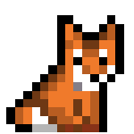
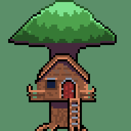
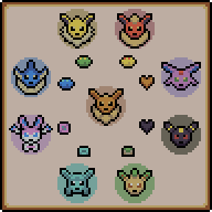
Don’t think it’s as good as the things you guys have been posting, but figured I’d throw it out here anyway since it’s something I’m kind of proud of. And hey, gets a bit more activity here.
Let me know what you think!
This shall be the community where we discuss, share, make and learn from each other how to draw the little pictures and game assets we all love.
Rules
-
To make it easy to identify original content, mark original content with [OC] in the post title.
-
If it is not your art, please credit the creator out of respect for their efforts.
-
Critizise art in a constructive manner and only when asked for.
-
Consider adding a copyright license hint to your post, if you are fine with people sharing your work.
-
This community is about enjoying art and appreciating artists, please do not post generated images here
Resources
- 0 users online
- 1 user / day
- 1 user / week
- 4 users / month
- 16 users / 6 months
- 1 subscriber
- 195 Posts
- 219 Comments
- Modlog
- mods:


I love small icons like these. The very minimal stones is a super nice touch too. Not a dig, but I wonder why you chose very desaturated colors? I guess usually people into pokemon choose very vibrant things.
Thanks!
I think all of my art at the time did, not really sure why. I think I wasn’t that happy about how I did shading, so I got in a bad habit of choosing low contrast colours to try and “hide” it. I do think if I did it nowadays, I’d try and be bolder with selecting colours.
Ah I see! I have a tendency for vibrant colors, but there’s nothing wrong with desaturation.