c/photography is a community centered on the practice of amateur and professional photography. You can come here to discuss the gear, the technique and the culture related to the art of photography. You can also share your work, appreciate the others’ and constructively critique each others work.
Please, be sure to read the rules before posting.
THE RULES
- Be nice to each other
This Lemmy Community is open to civil, friendly discussion about our common interest, photography. Excessively rude, mean, unfriendly, or hostile conduct is not permitted.
- Keep content on topic
All discussion threads must be photography related such as latest gear or art news, gear acquisition advices, photography related questions, etc…
- No politics or religion
This Lemmy Community is about photography and discussion around photography, not religion or politics.
- No classified ads or job offers
All is in the title. This is a casual discussion community.
- No spam or self-promotion
One post, one photo in the limit of 3 pictures in a 24 hours timespan. Do not flood the community with your pictures. Be patient, select your best work, and enjoy.
-
If you want contructive critiques, use [Critique Wanted] in your title.
-
Flair NSFW posts (nudity, gore, …)
-
Do not share your portfolio (instagram, flickr, or else…)
The aim of this community is to invite everyone to discuss around your photography. If you drop everything with one link, this become pointless. Portfolio posts will be deleted. You can however share your portfolio link in the comment section if another member wants to see more of your work.
- 0 users online
- 1 user / day
- 1 user / week
- 13 users / month
- 51 users / 6 months
- 1 subscriber
- 508 Posts
- 1.04K Comments
- Modlog
- mods:
- @SyJ@lemmy.ml


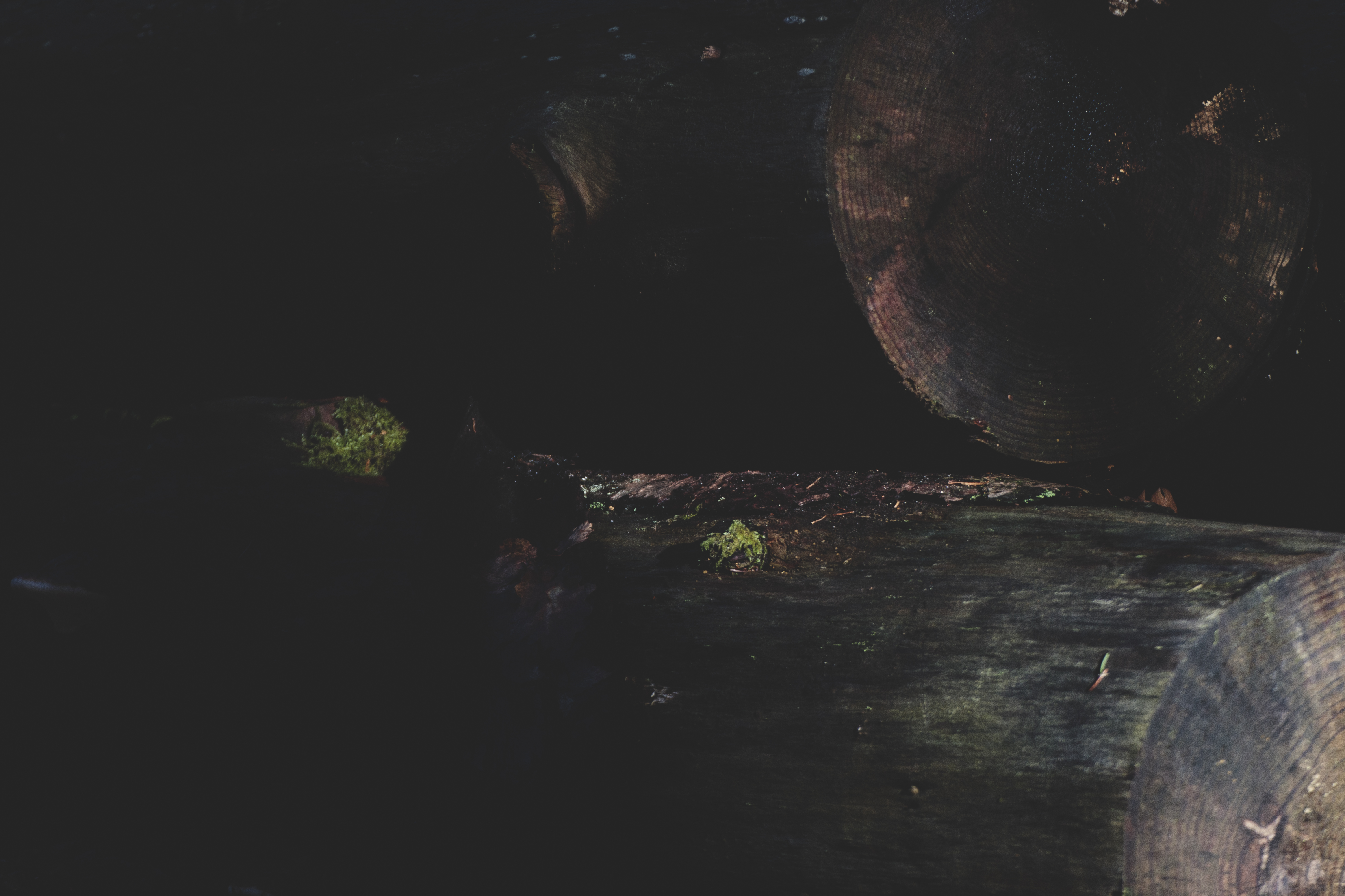
I like the dark and moody textures. The lack of contrast gives it an old analog feel. The main problem for me on this image is the lack of balance. All the interest is in the right side and I’m not drawn to anything on the left hand side.
I feel the same way. I rather like the colors and the oddly “retro” feel coming from the edit. But it feels very unbalanced. The log in the lower-right pulls the eye but then it’s cut-off in a way that’s unsatisfying.
I can totally see what you mean
Wow, it looks like planets.
I wanted to make this image feel sinister and minimalist, but I’ve stared at it for so long at this point that I don’t know if it’s good anymore. The preview is also, obviously, getting compressed horribly. For posterity, here is the full: https://p.drkt.eu/2024/_MG_4984.jpg
I wouldn’t say this feels sinister. IMO, it lacks the context required, but that’s just my feeling on it. Minimalist maybe, feels kinda retro like it’s shot on film without a huge amount of grain. Looks good though.
Maybe sinister is the wrong word :P Dark and faded, maybe?
Well, you got the dark and faded effect for sure.