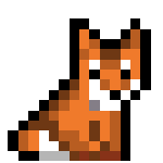
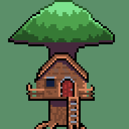
it was a lot more difficult than i thought it was gonna be, designing and all, im glad i got nuis 4thwall breaks in there
You must log in or register to comment.
This shall be the community where we discuss, share, make and learn from each other how to draw the little pictures and game assets we all love.
Rules
-
To make it easy to identify original content, mark original content with [OC] in the post title.
-
If it is not your art, please credit the creator out of respect for their efforts.
-
Critizise art in a constructive manner and only when asked for.
-
Consider adding a copyright license hint to your post, if you are fine with people sharing your work.
-
This community is about enjoying art and appreciating artists, please do not post generated images here
Resources
- 0 users online
- 2 users / day
- 4 users / week
- 4 users / month
- 19 users / 6 months
- 1 subscriber
- 204 Posts
- 231 Comments
- Modlog
- mods:


Ryuko’s portrait looks pretty good, but that red text is really painful on the eyes.
yeah understandable, i should have gone with a softer red instead of the bright klk font red